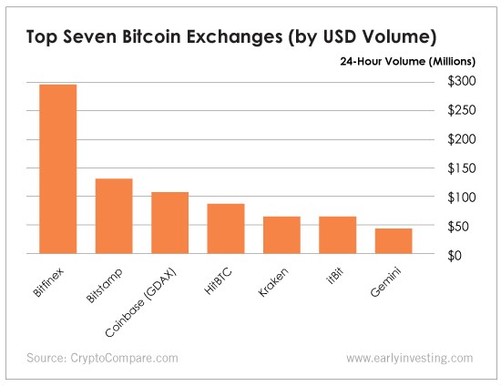
“Follow the money” is an old adage in journalism. (It was memorialized in the movie All the President’s Men). It’s a useful saying for investors too. In this week’s chart, we follow the money to see which bitcoin exchanges Americans (or U.S. dollar holders) are trading on.
So why is this chart important? Let’s follow the money.
We should note that this chart is just a snapshot in time. The data is from May 23, 2018. Another thing to remember is that the chart only reflects U.S. dollars being traded as bitcoin. It doesn’t reflect the yen (Japan), won (South Korea), euro (European Union) or other currencies being traded as bitcoin. That chart would look quite different. But neither of these factors affects the value of this chart.
The first thing to notice is the exchanges Americans are using to buy and trade bitcoin. That’s useful information. At Early Investing, we’re fans of Coinbase. But as you can see, there are other exchanges out there that do plenty of business.
The second thing this chart does is approximate overall market activity. This past Wednesday was a pretty busy day. If you had looked at this chart on Friday, you would have seen the highest 24-hour trading volume was $182.7 million. That’s a much quieter day.
Finally, the chart helps measure the volume of trading activity on an exchange, which is an important factor in price volatility. Bitcoin is already volatile enough as it is. But the more trades that are happening on an exchange, the more you can believe that those price gains (or losses) are real.
And in the cryptocurrency world, all you can do is ask for real!
