The Russell 2000 is an index that tracks small cap stocks.
Investors frequently buy funds based on this index to get exposure to small, fast-growing companies.
On the surface, this makes sense, since small caps have outperformed large stocks over the long run.
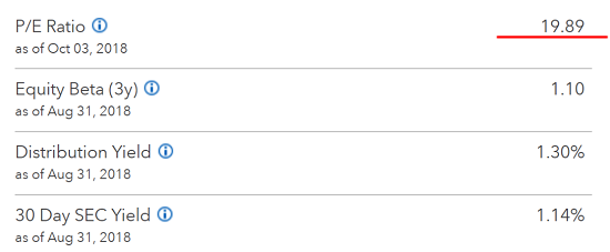
However, there are some serious problems with the Russell 2000. As I write, iShares, which owns the largest Russell 2000 ETF (NYSE: IWM), advertises the fund’s P/E (price-to-earnings) ratio as being 19.89 (meaning you have to invest $19.89 for every $1 of earnings).
The P/E ratio is a critically important valuation metric. It tells you whether a stock or group of stocks is cheap or expensive based on earnings.
A P/E ratio of 19 is slightly above the long-term average of roughly 15. But it’s still not outrageously expensive.
The problem lies in how iShares calculates the Russell 2000’s P/E. In an index fund, you typically take all of the companies’ earnings (and losses) and average them out by market capitalization.
But the iShares Russell 2000 ETF doesn’t include companies that have negative earnings in its P/E calculation. Neither does FTSE Russell, which maintains the index…
But according to USA Today, fully one-third of the Russell 2000 companies are losing money.
IShares does mention this unique calculation method, but only if you click the little “information” button beside “P/E ratio.” And it doesn’t mention that this is not the standard way to calculate earnings ratios.
So what’s the real P/E ratio of the Russell 2000? According to The Wall Street Journal, it’s actually 58. That’s nearly three times higher than the advertised P/E of 19.89!
So when I hear someone say they’re buying the iShares Russell 2000 ETF because small caps are “cheap,” it makes me want to tear my hair out.
“Official” Numbers
The Russell 2000 P/E deception is not unique. Lately I’ve noticed that the goalposts have been moved on all sorts of important numbers.
Official unemployment numbers are a prime example. According to government numbers, we’re at record-breaking employment levels.
The problem with the official numbers is the recent lows of the overall “Labor Force Participation Rate.” This measure tracks the percentage of eligible workers who are currently employed.
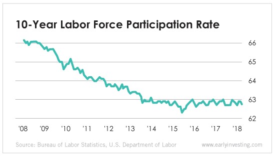
So only 63% of eligible workers are actually searching for work. The “official” unemployment numbers simply don’t include people who have been unemployed so long they’ve stopped searching for jobs. Unfortunately, that’s a large portion of the country.
Government inflation numbers are also suspect. Over the past 40 years, the way the U.S. government calculates prices has changed dramatically.
Governments around the world “adjust” prices in many different ways. One of the primary methods is to use “hedonic quality adjustments” (HQA) to hide price increases.
Here’s how it works. Using HQA, when a product gets better, it becomes more valuable. So if the price goes up, that increase often shouldn’t be reflected in official numbers. And if the price stays the same while the product gets better, that gets marked down as a decrease in price. It’s outrageous. Yet this is how the Bureau of Labor Statistics adjusts the Consumer Price Index (CPI). (For a more detailed read on HQA, read this.)
These types of price “adjustments” always go one way. They make it look like prices aren’t rising as fast as they are.
One economist, John Williams of ShadowStats.com, calculates inflation rates based on past official U.S. methodologies, and the results are shocking.
When Williams uses the pre-1980 methodology to calculate his own CPI today, he sees a 10% inflation rate. When he uses the CPI calculation used prior to 1990, it shows an inflation rate of around 6%.
ShadowStats publishes alternate data sets on unemployment and money supply as well. It’s all far, far different from the official, rosy picture we’re presented with.
The government moved the goalposts.
Governments have a major incentive to make things appear rosier than they truly are. They have to pay cost of living adjustments to millions of recipients of government programs. And those adjustments are based on the official CPI. So if the CPI doesn’t increase, neither does the amount that governments have to pay out. And no politician likes bad numbers. So they cook the books on inflation, unemployment and other stats.
In 2013, the government even changed the way we measure GDP. It added in items that weren’t previously included, like research and development costs, royalties and more. Estimates say that these changes “boosted” official GDP numbers by as much as 3%. Barely anyone noticed or cared.
The bottom line is this: Don’t make investment decisions based on “official” numbers. And always take rosy government reports with a healthy dose of skepticism.
There’s a good reason mainstream economists are usually shocked when a recession hits. It’s because they base all of their assumptions on “official” data.